On the one hand, some modern art seems kind of dumb, but on the other, I enjoy the fully-immersive sensation of being absorbed into the raw feeling of a painting. The respite from thinking and the invitation just to feel a color or an image.
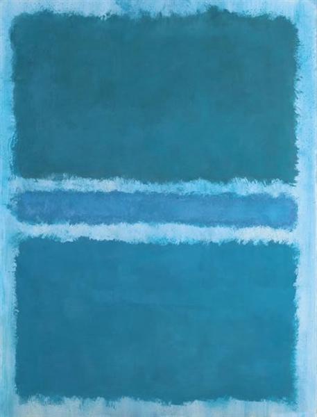
This one by Mark Rothko is entitled Blue Divided by Blue. Rothko has a few paintings like this one, which focus more on the color of the paint and how it appears on a canvas rather than the creation of a particular form (for example, a person). Apparently, this one was made during a period of depression.
At the SFMOMA another appears that is much larger and which gives you some sense of how big some of his paintings are.
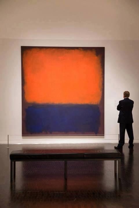
Images on a phone don’t do Rothko justice, as the color is mediated by pixels, but the feeling of coolness of the blue above and warmth of the orangish-red below: it’s easy to get lost in it, and there’s a marked difference in how they make us feel.
Why do we feel this way I wonder?
